Basics of the GUI
For a sytem with three interfaces, a relatively large section of this book is devoted to the GUI. This isn't surprising when you think about the popularity of GUIs and the fact that a GUI designer needs to worry as much about form as function.
The Amiga GUI has two parts: Intuition and Workbench. As a developer, you will be more concerned with Intuition. It consists of the function libraries and tools you will use to create and run GUIs for your application.
Before talking specifically about the elements of the Amiga GUI (in the next five chapters), some basic elements and techniques need to be discussed.
Metaphor
One of the reasons for the success of GUIs is that they greatly reduce the need to memorize commands and command structures. One technique used to accomplish this is the use of metaphor - GUIs try to mimic the traditional work world in some way.
By presenting what can be frighteningly complex workings as familiar, real-world objects and activities, even novice users can understand and use a computer quickly. Hierarchical filing systems become drawers. RAM caches that spool to disk become clipboards. Pulling an ASCII clip from a buffer into a document becomes pasting.
To employ a metaphor in your application, look for some common physical system that is analogous to the behaviour of the application.
For example, a 3-D modelling package could be designed to work on wire-frame objects as though they were actually physical objects. The user could rotate the object by "grabbing" a corner of the object and pulling just as one would grab the corner of a real object.
Of course, it is not always necessary or even desirable for every interface to be modelled after some physical object.
Object-Action
Most of the popular GUIs today encourage the use of object-action methodology. This simply means that first the user selects the thing he wants something done to, then he selects what he wants to do with it. For example, first he clicks on the object he wants deleted then he chooses the delete function, rather than choosing delete then clicking on the objects to be deleted.
This is done mainly to prevent modality. Modes are generally avoided in GUIs because they can easily become restrictive and confusing to the user. If the user were to select delete before selecting the object(s), he would be in delete mode and could accidentally delete something he wanted to save - especially if he were to go away and come back later. There is also the problem of how to indicate the last object to delete. In general, any mode is limiting and should be avoided if possible.
Focus
When a user is looking at a computer screen, he is most likely to concentrate his attention on one particular spot. In a word processor, he will most likely be looking at the cursor. Or in a CAD program, the focus may be the currently selected line or polygon. Very often, the pointer itself is the focus.
It's important to identify the user's focus because this can be a very effective channel of information. For example, you can animate or change the appearance of the focus object to indicate some change in the program's state. The wait or busy pointer is an example of this. If the wait pointer's clock imagery appeared in the title bar instead of on the pointer, it would be far less effective.
Feedback
Users expect to see an immediate reaction to every action. Even if the action will take some time, they expect to see some indication of "I'm working on it" such as the normal pointer changing to a wait pointer.
Try to provide feedback through as many appropriatemedia as you can. For example, when a user drags a note in a music package, he could hear the pitch change as well as see the note move. After all, the visual graphic of the note is only a representation of the sound of the note - and that's what the user is really interested in.
It's usually easy to provide instantaneous feedback to simple actions, but for more complex or time-consuming actions, a surrogate feedback may be necessary. A familiar example of this is the way windows are dragged on the Amiga - you don't drag a window, you drag an outline of it. Another example of feedback on time-consuming activities is the word processor that refreshes just the line being worked on as the user is typing, and the whole display whenever there is some processing time to spare. This gives the illusion of responsiveness, which from the user's point of view is as good as the real thing.
When the user attempts an action, provide feedback.
Colour
Colour is a very powerful medium of communication. Be conscious of what message you are communicating.
Keep in mind that simple images with fewer colours usually work better than complicated colourful ones. When choosing default colours for an application, do not use intense combinations like blue/yellow, red/ green, red/blue or green/blue. Use subdued colours instead of fully saturated colours. Colour can set the mood of your program and that mood should be one that the user can live with for extended periods of time.
Give Controls
For all the screens you set up within your application, provide the user with the ability to load, save and edit the colour palette. When the user makes a change to the colour palette, examine the new palette to assign the appropriate colours for rendering.
Colour as a Cue
Be consistent when using colour to indicate meaning. Window backgrounds should be in the background colour, text in the text colour and headings in highlighted text.
Don't use colour as the sole cue - some users work in monochrome.
Beware of using colour alone to convey information - especially in small areas of the display. Some users may work on a monochrome display. Keep in mind also that many people are colour blind. For these reasons, try to reserve the use of colour only as an extra cue, used in conjunction with other cues such as position, size and rendering.
Check Visibility
The Amiga's Preferences editors allow users to run their applications in two colours. Certain high-resolution monitors have only grey-scale displays. Because of these cases, if your application can open on Workbench or a public custom screen, you should check that your graphics and text can be read on a monochrome or grey-scale display.
Elements should be visible, should continue to provide visual feedback, and should be recognizable as the same element whether in colour or monochrome. Basically, you should make sure that all your functionally significant colours constrast with adjacent functionally significant colours. It's more a matter of the colour's brightness or luminance than the actual colour itself.
Commodore's high-resolution grey-scale monitor (A2024), for instance, uses patterns made up of its four basic greys to make more shades when running in medium and low resolutions. At these resolutions, things look best if you choose a colour that maps to a solid, not patterned, grey. But these colours are not obvious.
One palette that produces solid greys follows:
- Colour 0: Light Grey, RGB=10,8,6
- Colour 1: Black, RGB=0,0,2
- Colour 2: White, RGB=15,15,15
- Colour 3: Dark Grey, RGB=7,7,9
Here's a sample palette that works well on a grey-scale monitor.
Understandably, some applications that open only on a multicolour custom screen don't need to work in monochrome, but checking for at least grey-scale functionality can help your program's readability. In the magazine industry, for example, many art directors will transform colour headlines to grey-scale and check the contrast. If the headlines aren't readable while in greys, there is a contrast problem, and the art director will change the colours.
Fonts
Users can specify which font the system should use for the Workbench icon font, the screen font (the preferred system font) and the system default font (a default monospaced font). These are selected with the Font Preference editor in the Workbench's Prefs drawer.
Your application should try to adjust itself to whatever size the user may select. Menus, windows, requesters and gadgets must all be adjusted to allow the various text sizes to fit.
Keep in mind that the chosen font may be monospaced or proportionally spaced, and not every application can handle a proportional font. A spreadsheet, for example, depends on the font being monospaced to properly handle the columnar data it manipulates. If your application needs a monospaced font it should honour whatever the user has chosen to be the default system font - that font is guaranteed to be monospaced.
If your application can handle a proportional font, however, it should honour whatever the user has chosen to be the screen font.
Internationalization
Since the Amiga is sold in a world market, internationalization is an important design factor in your application. One of the most important and fundamental issues to consider when thinking about internationalization is the difference in length of the text between English and any other language.
English is one of the most terse language, and when converting English to, say, German the text the text is bound to grow 30-50% in size.
Another thing to keep in mind is the desirability of building a text table that is centrally located so that it can be adjusted by the user. Do not scatter embedded text throughout your application; consider putting it in a file instead. This way, the text can be easily localized by updating one central table, or even by loading a new text table from disk.
Don't make every text item adjustable. For instance, if your application incorporates a procedural language or ARexx keywords, do not allow these special words to be localized. To do so would severely hurt the ability to share scripts between international users.
If your application provides database-like operations that involve money,numbers, telephone numbers and addresses, remember that these sort of fields vary in usage from country to country. The table below lists some of the differences.
Commodore has an extensive distribution network for its hardware. If you want to sell your software internationally, it is best to build inter-nationalization into your application from the start.
International Formats
| Language | Date | Time | Hours | Decimal | Thousands Separator |
| American English | mm/dd/yy | hh:mm:ss | 12 hr | period | comma |
| Australian English | dd/mm/yy | hh:mm:ss | 12 hr | period | comma |
| British English | dd/mm/yy | hh:mm:ss | 12 hr | period | comma |
| Canadian French | dd/mm/yy | hh:mm:ss | 24 hr | comma | space |
| Danish | dd/mm/yy | hh:mm:ss | 24 hr | comma | period |
| Dutch | dd-mm-yy | hh:mm:ss | 24 hr | comma | period |
| Finnish | dd.mm.yy | hh:mm:ss | 24 hr | comma | space |
| Flemish | dd-mm-yy | hh:mm:ss | 24 hr | comma | period |
| French | dd.mm.yy | hh:mm:ss | 24 hr | comma | space |
| German | dd.mm.yy | hh:mm:ss | 24 hr | comma | period |
| Italian | dd-mm-yy | hh:mm:ss | 24 hr | comma | period |
| Norwegian | dd-mm-yy | hh:mm:ss | 24 hr | comma | space |
| Portuguese | yy/mm/dd | hh:mm:ss | 24 hr | comma | space |
| Spanish | dd/mm/yy | hh:mm:ss | 24 hr | comma | period |
| Swedish | yy-mm-dd | hh.mm.ss | 24 hr | comma | space |
| Swiss French | dd.mm.yy | hh:mm:ss | 24 hr | period | apostrophe |
| Swiss German | dd.mm.yy | hh:mm:ss | 24 hr | period | apostrophe |
The 3-D Look
Release 2 of the Amiga operating system features a three-dimensional look to its GUI. Whenever possible, elements are drawn so that light appears to come from the upper left of the display with shadows cast to the lower right. This gives the illusion of depth.
The outside border of a raised object has thin lines forming the top and left sides; dark lines for the bottom and right sides. Reverse these colours for a recessed image.

Fig. 2.1: Raised and recessed images.
Using this simulated depth, you can make images appear to be standing out or recessed in the display, thus giving the user a context cue at the same time.
Fig. 2.2: Close-up view of 3-D box corner with a pixel grid superimposed.
If an icon or gadget appears raised, this means it is available for use or modifiable. If its default appearance is recessed, this means it is unmodifiable or for display purposes only. Another context cue: when a user clicks on an icon or a button-like gadget, it should change from a raised image to a recessed, highlighted image. This goes along the basic idea of providing feedback that the attempted action (clicking on an action gadget, for example) has worked.
Objects that highlight should show distinctly different imagery between highlighted and non-highlighted states. One convention used by Workbench is to display the image in complementary colours.
Fig. 2.3: Examples of non-highlighted and highlighed gadgets.
Ghosting
When a control is unavailable for selection, it should be obviously unselectable. Do not allow the user to select something that does nothing in response.
Intuition will automatically display a ghosting pattern - a grid of dots in the "shadow" colour - over an unavailable control. If, however, you need to do it manually, follow the example shown below:
Fig. 2.4: A normal and enlarged view of a ghosted gadget.
GadTools
If you are developing for the Release 2 environment, you don't need to worry about incorporating the 3-D look into your gadgets - GadTools will do it for you. GadTools is a toolkit that supplies pre-programmed, standard application gadgets for use in your application.
Whenever possible you should let GadTools work for you. Even beyond the standardization of function it provides, this tool frees you to spend more time and effort on the crux of your application.
The System as Your Guide
In the absence of any system-provided support, or if the special needs of your application require you to build your own elements, use existing system elements as a general guide to style and function.
The Mouse
Having graphics on the screen that represent something to the user is good, but you need a way for the user to interact with those graphics. Although a number of devices can be used to do this on the Amiga (including a touch screen, a joystick or even the keyboard), most often the user will interface with the GUI via a two-button mouse.
Using a mouse can become a seamless, unconscious act for most users in the same way that a typist can type the letter "k" without consciously thinking: "Let's see...right hand, third finger from the right." Typists are able to do that because typewriter manufacturers make their keyboards consistent. Likewise, it is important that your software follows rules of mouse usage so that the GUI is "mechanically" consistent.
Follow basic rules for the mouse so that its use becomes instinctive.
The standard Amiga mouse has two buttons: the selection button (left) and the menu button (right).
Fig. 2.5: The mouse buttons.
The selection button (the left mouse button) selects or operates gadgets, icons, windows and screens. It can also be used to select special objects unique to your application (eg. the note object in a music package) or to set the pen "down" in a drawing operation.
The menu button (the right mouse button) actives the menu system and allows the user to choose a menu item. The menu button may also be used to abort a selection button operation. For example, the user is dragging a window around by holding [down] the selection button and moving the mouse. If he decides that this action was a mistake and wants the window back where it was originally, he can press the menu button and the window should snap back to its original position.
Activating Tools
Clicking on a tool gadget, such as the Fill tool in a paint package, with the selection button should activate the tool. If appropriate, a double-click could activate a settings editor for the tool so that the user can fine-tune the way the tool works.
Actions should be triggered on the release of the selection button.
Triggering a Process
When the selection of something will trigger a process, the action should occur on the release of the mouse button - not the downpress. This way the user can change his mind about the operation and move the mouse away from the object before he releases the button.
Current Objects
When an object is selected, that object is considered to be the current object. Some examples are: the highlighted section in a CAD program, a note in a music program, or the character under the cursor in a word processor. When the user chooses an action (via a menu item, for example) that action is carried out on the current object. For example, in a desktop publishing program the user can click on a text box and make that the current object. If the user selects an action such as "erase" or "copy", that action is performed on that text box.
Shift Selecting
In some instances, a user can select more than one item at once by using shift selection. The user clicks on an item with the selection button. While holding the Shift key down, the user can then select any number of objects. The result is called a selected group. Some examples of objects that could be grouped are: columnar text boxes in a DTP program, notes in a music program and text items in a list.
Some actions that can be carried out on current objects will still apply to a group, such as copy or delete, but others may not. For example, you can have a requester showing the attributes of a current object but it would be difficult to have such a requester for a group of dissimilar objects.
Dragging
Objects can also be grouped by dragging. Dragging, a common mouse operation on many platforms, involves holding the selection button down while moving the mouse. There are two types of dragging: contiguous and non-contiguous.
A good example of contiguous dragging can be found in a word processor. The user clicks on a letter then, without releasing the selection button, moves the cursor somewhere else in the text. The first letter he clicked on becomes the "anchor" point and all the text between the anchor point and the point where the selection button was released should be highlighted. The highlighted text is now a selected group.
Objects can also be grouped contiguously by the use of the marquee. When the mouse is dragged on Workbench, for example, an animated dotted line, the marquee, marks the area covered by the mouse. All the icons within the marquee will be selected.
Fig. 2.6: Grouping by using the marquee.
Less common is non-contiguous dragging. One example of this is a program that allows the user to drag select a section of text and then deselect individual lines by clicking on them. The deselected line can be in between two selected lines.
In both styles of dragging, the display should scroll automatically if the mouse goes beyond the boundaries of the display region.
Four Ways to Highlight Text
There are four methods you can use in your program to highlight text: dragging (see the previous section), extended selection, multiple-clicking and selecting all.
With extended sselection, the user clicks the cursor in the text (this becomes the anchor point), then shift-clicks the cursor at another place in the text. The area between the anchor point and where he shift-clicked will be highlighted. Note that the user can adjust the window's scroll bar between clicks and thus highlight a very wide range.
If you employ the multiple-click method, the user can select a word by double-clicking on it, or select a paragraph by triple-clicking on it. (Note: these are not timed clicks.) A "word" can be defined simply as anything with spaces around it, or you can use a more complex definition. A fourth click should revert back to a normal cursor.
Selecting all would feature a menu item that would select all the characters in the document. This action shouldn't select the document as well; that is, any actions chosen for the selected group should not act upon the document itself. For example, if the user chooses select all and then erase, all the characters should vanish from the document's window but the window should remain.
There should only be one current object or one selected group at one time.
Current Objects vs. Selected Groups
Current objects and selected groups should not co-exist in the same application. In other words, no matter how many projects your application may run simultaneously, there should be only one current object or one selected group at any one time. If the user has a current object, then creates a group through shift selection, there should no longer be a current object.
Selection Context
Confine the user's ability to select to a single context or "level". For example, don't let the user select documents and characters at the same time. You can allow him to select any numbers of characters in a document, or any number of documents, but not both at once.
The Pointer
The Amiga uses a pointer that the user can redesign. The default pointer looks like this:

Fig. 2.7: The default pointer with a superimposed pixel grid.
Your application can use a custom pointer instead of the standard. The arrangement of colour intensity in your custom pointer should be consistent with that of the standard pointer - especially since two different applications can share the same screen.
Technical note: here's how the colours should be set up:
| Colour 0 | Transparent |
| Colour 1 | Medium intensity |
| Colour 2 | Darkest |
| Colour 3 | Brightest |
The pointer should be framed by either colour 1 or colour 3 to ensure its contrast on most screens.
Waiting
When your application is busy with a task and temporarily cannot accept input, another pointer, known as a wait pointer, appears.
Fig. 2.8: Workbench's wait pointer with a superimposed pixel grid.
Currently the wait pointer used by Workbench is not accessible by developers. Shown here is a pixel-by- pixel view of Workbench's wait pointer if you want to make yours look similar.
If the wait is for a measured amount of work, such as in a ray-tracing program, your application should provide a requester that shows the progress of the activity. The progress requester should have a gadget on it allowing the user to stop the activity.
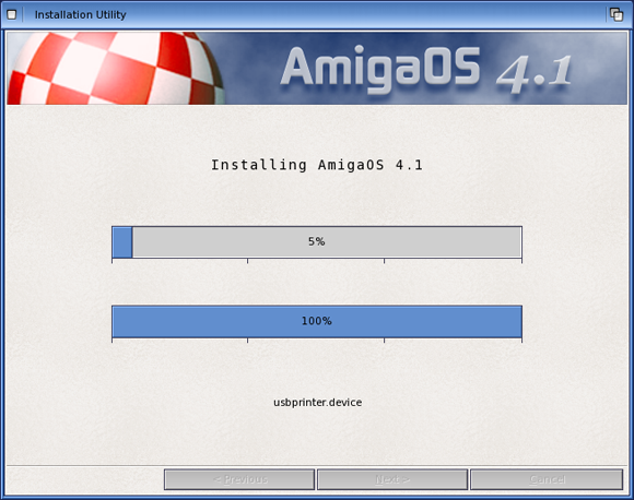
Fig. 2.9: A sample progress requester indicating the progress of a time-consuming activity.
Use a progress requester like the one shown on the previous page instead of an animated pointer to indicate that the application is busy. Here's why: A man is rendering a simple object with a ray-tracing package. While waiting for that to finish, he decides to write a letter in a word processing package that opens on the same screen but in a different window. If the ray-tracing program displayed a progress requester, he could see when the rendering was done. But if it used an animated pointer, that pointer would disappear when he clicked in the word processing window.
Don't tie a wait pointer to the progress requester (ie. when the user clicks on the progress the pointer changes to a wait pointer). If you do, the user may think he can't activate the "Stop" gadget.
Don't show multiple cycles in the same progress bar. For example, if the progress bar reads "Calculating...", fills up and then reads "Rendering...", you've falsely built up the hopes of the user. Instead, use multiple bars if knowing the progress of each task is important to the user, or a single bar that is filled only once if knowing when the job is done is all that is important.
Pointers with Purpose
Pointers can be used to give the user a context cue. For instance, if your application supports different tools, such as the sketch tool or the fill tool in a paint program, the pointer imagery can reflect the currently selected tool.
Or, if your window is divided into distinct areas with different uses, it might be more appropriate to have the pointer image reflect its current purpose based on its position. The pointer for a CAD program, for example, might be a cross-hair while it is over the drawing area, but turn into the standard arrow when it is over the control panel area.
Resolutions
The Amiga hardware and software offers a variety of resolutions for the user to choose from. The resolution refers to the number of pixels in that mode. For instance, a common Amiga resolution of 640x200 refers [to] the number of pixels in height and width, respectively.
Design your GUI on a 640x200 screen with the Topaz 8 font.
If you allow the user to choose resolutions, make sure that your GUI fits comfortably on whatever screen the user has chosen. A good way to do this is by checking it on a least common denominator resolution - a non-interlaced, non-overscan NTSC screen (640x200) with a Topaz 8 font. You don't need to set these as defaults; just make sure that what you create will look and function normally when set to these settings.
If your original target audience will most likely be using PAL, it's still a good idea to design with a 640x200 NTSC screen in mind so your distribution isn't limited later.
Respect the choices the user has made in his Preferences setup for resolution and how large a display should be set up.
Technical note: If your application is text-oriented, make sure you use the text overscan setting. If it's graphic-oriented, use the "standard" overscan setting. The user can set both of these by using Workbench's Overscan Preferences editor.