Menu design
Use the same criteria for designing the menu system as [for] other elements of the GUI: design it on a 640x200 screen with the Topaz 8 font. At run-time, your application should test to see if the menu will fit in the user's preferred font and screen size. If not, revert to the Topaz 8 font.
Colours
When possible, menus should use dark text on a light background. Note: the examples shown in this chapter don't follow this rule because the version of Release 2 they were taken from had colour constraints that prevented this rule from being obeyed.
Font
A uniform font is recommended for all the menu items within an application. A change in font style could be appropriate, however, if it symbolizes a change in the style of text in your application. For example, in a word processor, a menu called Style may list the type styles Bold, Italic and Underline. Those menu items may be rendered in bold, italic and underline text, respectively.
Toggle Items
Some menu items turn an option on or off. To show this, use a check mark that toggles visible and invisible in a space in front of the item. Don't add a submenu with items such as "on" and "off".
Toggle items should be indented to allow room for the check mark. This will give the user a visual cue that it is a toggle item.
Fig. 6.2: A toggle menu item shown in both states.
Organization
Within a menu, items should be grouped according to function. Distinct groups should be separated with a separator bar. "Function" can be deefined by these three rules:
Separate the toggle items from the non-toggle items. This will help the user quickly distinguish one type from the other. It will also look better if the left-hand side of the menu text doesn't indent more than once.
Group similar choices together. For example, if a menu includes the items
- Save as ASCII
- Save as MystrEd doc
- Quit
- New
- Save as IFF clip
the three Save as... items should be grouped together.
When ordering menu items, make sure to separate commonly used items from dangerous ones.
Frequently used items should be placed towards the top of the menu. When ordering the items, make sure to separate commonly used items from dangerous ones. It's relatively easy for a user to choose the wrong menu item by mistake - try to anticipate such mistakes and their possible outcomes and arrange your menus to avoid them.
Limit the Size
Try to limit the number of items in a menu to about a dozen. Submenus should have about a half dozen items at most. The utility of a menu decreases as its length increases.
On the Menu Bar
When it comes to ordering the menus themselves on the menu bar, remember that the user can most easily access the outside menus. Put menus that are used less towards the middle.
Follow the order given in the Standard Menus section of this chapter for any standard menus.
Ghosting
Whenever a menu or menu item is inappropriate or unavailable for selection, it should be ghosted. Never allow the user to select something that does nothing in response.
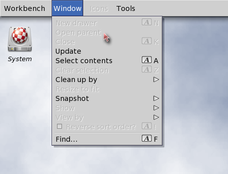
Fig. 6.3: A menu with ghosted items.
Labelling
Menu and menu items labels should be terse - preferably one to three words. Use the capitalization rules that apply in the language at hand.
Menu items that represent an action should reflect that action in the item's label. For instance, "Print" is better than "Printer". Try, also, to keep the terminology user-friendly and non-technical.
Don't repeat a menu's title on every item's label. For instance, in a Macros menu use the label "Load..." rather than "Load Macros...". Repeat the menu title, however, if user comprehension will suffer.
Toggle Items?
As discussed earlier, indenting toggle items lets the user know that they represent a choice. Another cue you can give to the user is to end the label in a question mark. In some Settings menus, for example, an item labelled "Create Icons?" is preceded by a check mark (or placeholder) and ended with a question mark. Both are cues to the user that this is a toggle item.
Ellipsis
When a menu item brings up a window or requester, an ellipsis (three dots) should be appended to the menu item's label.
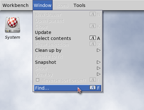
Fig. 6.4: A menu item that brings|up a requester or another window.
Submenus
When an item has a submenu, the symbol » should be placed on the far right side of the menuy item. These should be flush right (see the next section).
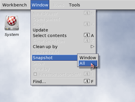
Fig. 6.5: A menu item that brings up a submenu.
Lining Up on the Right
If you have any symbols or text that you want to line up on the right side of the menu item, make sure it is flush right (ie. right justified) or it won't line up properly when used with a proportional font.