Windows
A window is simply a graphic rectangle on an Amiga screen, but it tells the user that everything within its boundaries is linked by a common bond - be it a common directory, program or document. If he returns to that same window later, he knows from experience what that window can be used for.
Fig. 4.1: A window.
A Safe Place to Click
Try to provide a safe place on each window where the user can activate it without altering any previous work. For instance, if the user were to return to a text processor window after checking his email, he should be able to activate the window and not have his cursor move. The title bar is a good area for this.
If your application uses the whole window for operations and has has no window title bar (like some paint packages), let the first click of the mouse on an inactive window activate the window instead of doing an operation.
Size and Position
Each window opened by your application should be able to fit within a medium resolution screen, 640x200, with the Topaz 8 font. These don't need to be the defaults, just a working guideline. See Resolutions for more information on this.
Your application should provide a default location and size for its windows. By default the windows should open within the current view area of the screen (remember that some users work with virtual screens) and should be scaled per the current resolution. You should, however, let the user override these defaults both temporarily and permanently.
The Save Settings menu option allows the user to specify a default size and position for windows.
For example, if the user moves or resizes a window during a session and later closes the window, your application should remember those settings and use them if the user reopens the window within that session (a "session" being the time between when the user starts the application and when he chooses the Quit Program menu item). In this case, your program should remember the user specified positions only for the length of the session.
Let the user store his preferred window position "permanently" via the Save Settings menu option for more information on menus). Unlike the scenario in the previous paragraph where the position is remembered only for that session, Save Settings saves the position for use each time the application is opened.
Opening at Different Resolutions
Save Settings should also save the screen width and height so that the window rectangle can be scaled, if necessary, according to the screen size.
For instance, imagine that the user has set his preferred window position to the lower half of a 640x400 screen. If he later runs the same application on a 640x200 screen, the window will have to be adjusted to fit properly on the screen. The first action to take would be to move the window to a place on the screen where it will fit. If this doesn't take care of the problem, the window should be scaled.
In the example above, the screen height was halved, so the position of the window's top edge should be moved up halfway to the top of the screen. If the window has a sizing gadget, the window size should be scaled as well. Be sure to take into consideration the font used in the window title bar when computing the window's maximum/minimum sizes.
If you're window can't be scaled and doesn't fit in a certain resolution, consider restricting the screen's resolution that the window opens on. Try, though, to respect whatever choices the user makes.
Opening on a Virtual Screen
Screens can be many times the size of the actual display area. When opening a window within one of these screens, make sure the window is positioned by default in the onscreen display area, but if the user changes those defaults via the Save Settings menu option, respect the user's settings, even if it causes your window to open offscreen. He may have a reason for wanting the window to appear where it does.
Fig. 4.2: Overlapping windows.
Successive Windows
When your application opens a number of project windows, you may want to position each successive window slightly lower than the previous one - preferably, the height of the title bar plus one pixel. This will leave the window depth arrangement gadget open.
Window Gadgets
Here is a specific discussion of when and how to use system gadgets on your windows. More about gadgets can be found in the next chapter.
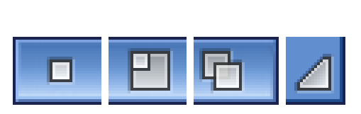
Fig. 4.3: Window gadgets.
Dragging Windows
Whenever possible, windows should be draggable. Requesters and support windows should always have a title bar that can be used to drag the window. An immovable support window could block important information that relates to it. A Find and Replace window, for example, may obscure the view and thus the spelling of the word the user wants to search for in the document.
Sizing and Scrolling Gadgets
When a window contains a view or editing area, like in a text editor, it should have a sizing gadget so the user can adjust the window to show more information. If the entire window is used as the view area, a scroll gadget should be added in the right-hand border of the window.
Zooming Windows
The first click on the window's zoom gadget changes the window to its alternate size; the next click restores it to the size it was before the gadget was clicked.
You will have to specify what the small size of your window will be; Intuition will handle the rest. If the window is sizable and your application opens full size, the setting should be the minimum size of the window, which can vary according to your application's needs. If your application opens small, the zoom gadget's alternate size should be initialized to full size. If the window isn't sizable, the minimum size should be the height of the title bar and whatever width is necessary to fit the title of the window; or you may choose to omit the zoom gadget altogether.
AppWindows
The active part of an AppWindow (see Chapter 7 for a discussion of AppWindows) should be indicated by an icon drop box gadget. This gadget should be an outlined rectangle. If your AppWindow has different areas that perform different operations, each area should have a separate icon drop box.
Fig. 4.4: An icon drop box gadget.